The Importance of EHR Interoperability for Urban AIAN Veterans

In a recent ranking of the health care systems of high-income countries, the Commonwealth fund ranked the United States the worst out of the 11 analyzed. Along with the well-documented problems of high cost and poor access, the ranking also focused on the administrative inefficiencies in the American System. Unlike other countries, the United States has failed to implement a functioning system of portable Electronic Health Records (EHRs).i This failure leads to the “blocking” of crucial health information and the impairment of the “safety, quality, and effectiveness of care provided to patients.”ii The ability for patients to access their EHRs across multiple providers is important for better care coordination.

In an attempt to address this failure, in 2009 President Obama signed the Health Information Technology for Economic and Clinical Health (HITECH) Act to promote the adoption of EHRs by Medical Providers. Unfortunately, the HITECH Act did not provide adequate incentives to encourage the use of EHRs. By 2015, only 6% of physicians had the ability to share patient data across EHR systems.iii This failure effects the quality of care of every American, but the challenges are greatest for patients who must regularly interact with multiple disconnected healthcare providers, such as American Indians and Alaska Natives.

All federally-recognized American Indians and Alaska Natives (AIANs) are entitled to receive care through the Indian health system managed by the Indian Health Service (IHS). AIANs have historically served in the U.S. military at a higher rate than any other populationiv, and these veterans are also entitled to receive healthcare through the veterans’ healthcare system managed by the Veterans Health Administration (VHA). However, AIAN veterans report significant challenges because IHS systems and VHA systems are not currently interoperable to connect and share patient information with each other.

The 144,844 AIAN Veterans who live in Urban Areasv face an even more complex challenge. Many cities with large populations of AIAN Veterans contain no IHS facilities. IHS-funded Urban Indian Organizations (UIOs) serve 39 cities. Still, UIOs do not provide inpatient healthcare services, so Urban AIAN Veterans must interact with local healthcare systems to fully meet healthcare needs, which do not currently speak to each other.

In the most recent American Community Survey Five-Year Dataset (ACS 2017-21), 9.4% of Urban AIAN Veterans (under age 65) report being “currently covered” by the “Indian Health Service” and 39.4% report being “enrolled for VA health care.” Interestingly, 4.5% report overlapping coverage from IHS and VA.vi

Table 1 lists the percentage of Urban AIAN covered by IHS and VA for the 20 cities with the largest Urban AIAN Veteran Populations from ACS. Unsurprisingly, IHS coverage is lowest in cities which contain no IHS facilities and no Urban Indian facilities (Washington-DC, Houston, Atlanta). The exception are Veterans in Denver and Dallas which report an approximately 5% IHS coverage rate even though those cities do not contain IHS facilities.vii It is possible that some veterans are categorizing their use of services by UIOs as “IHS Coverage” when responding to the American Community Survey. IHS is highest in cities with multiple IHS facilities (Phoenix, Oklahoma City).viii In general, in cities where IHS coverage is high, overlap with VA coverage is also high.

Table 1: IHS and VA Coverage in Twenty Metro Areas with Largest Urban AIAN Veteran Population.

Metro Area

% Covered by IHS

% Covered by VA % Covered by IHS and VA

2021 Urban AIAN Veterans

Phoenix, AZ 26.6 36.3 13.0 5015
Los Angeles, CA 1.6 38.4 0.4 4780
New York, NY 7.9 28.5 4.9 4149
Washington, DC 0.2 27.4 0.2 4033
Seattle, WA 6.2 38.5 5.1 3947
Dallas, TX 4.6 42.3 1.7 3843
Houston, TX 1.8 42.1 0.7 3633
San Diego, CA 7.6 50.2 3.8 2890
Riverside, CA 11.9 41.5 7.5 2738
Chicago, IL 2.9 39.2 1.1 2667
Denver, CO 5.4 37.5 1.9 2596
Portland, OR 7.5 33.6 2.5 2559
Oklahoma City, OK 42.3 37.8 22.4 2389
San Antonio, TX 2.8 53.0 0.8 2349
Albuquerque, NM 47.5 35.4 21.0 2097
Atlanta, GA 2.2 35.4 0.8 2059
Las Vegas, NV 6.6 38.7 3.2 2034
Jacksonville, FL 0.9 37.3 0.9 2022
Austin, TX 3.1 49.2 2.6 1895
San Francisco, CA 0.3 27.8 0.0 1873

There are multiple issues with interpreting these results. The ACA asks about IHS “coverage plans” in the context of a question about health insurance, so it is unclear how a respondent should answer if they receive some healthcare through IHS, but also some from other providers outside the IHS health system. It is also unclear if patients receiving care from IHS-funded Urban Indian Organizations would include themselves as part of “Indian Health Service” coverage.

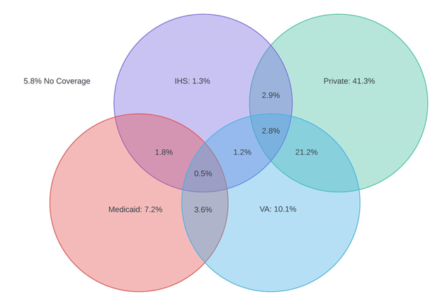
Adding another layer of complexity, Urban AIAN Veterans must also manage the overlap between the IHS and VA healthcare systems and their insurers (Figure 1).

Figure 1: Urban AIAN Veterans Overlapping Coverage

Figure 1: Urban AIAN Veterans Overlapping Coverage

Only 1.3% of Urban AIAN Veterans receive coverage solely through IHS. Overlap with other healthcare systems and insurers is more common. 1.8% of Urban AIAN Veterans receive services from IHS while enrolled as a beneficiary of Medicaid. 1.2% of Urban AIAN Veterans receive services from both IHS and VA without any insurance coverage. 2.8% of Urban AIAN Veterans receive services from both IHS and VA while enrolled in private insurance. 10.1% of Urban AIAN Veterans receive coverage solely through IHS. 21.2% of Urban AIAN veterans receive services from the VA, while also enrolled in private health insurance.

The need for interoperability is clear, especially for Urban AIAN Veterans who may navigate multiple systems of care, that would benefit from coordination. In 2016, the 21st Century Cures Act passed and is currently being implemented with increasing requirements for interoperabilityix. In response to these requirements, IHS is piloting a “Four Directions Hubs” which connects IHS to the Joint Higher Information Exchange of the VA through the national Ehealth exchange as a positive reinforcement of the required effort. The pilot was implemented at 4 IHS sites with preliminary success. It is important that this effort can be scaled up to improve the multiple healthcare systems accessed by Urban AIAN Veterans to support the full I/T/U system.

i “Mirror, Mirror 2021: Reflecting Poorly,” August 4, 2021. https://doi.org/10.26099/01dv-h208.

ii Office of the National Coordinator for Health IT (ONC). 2015. Report to Congress on Health Information Blocking. April 2015. Available at: https://www.healthit.gov/sites/default/files/reports/info_blocking_040915.pdf

iii Reisman, Miriam. “EHRs: The Challenge of Making Electronic Data Usable and Interoperable.” Pharmacy and Therapeutics 42, no. 9 (September 2017): 572–75. https://www.ncbi.nlm.nih.gov/pmc/articles/PMC5565131/.

iv Proclamation on National Native American Heritage Month, 86 C.F.R. § 60545 (2021), available at https://www.whitehouse.gov/briefing-room/presidential-actions/2021/10/29/a-proclamation-on-national-native-american-heritage-month-2021/.

v U.S. Census Bureau, 2017-2021 American Community Survey 5-year Public Use Microdata Samples (2022), retrieved from https://usa.ipums.org/usa/sda/. Urban Veterans are defined as respondents who 1. Reside in a Public Use Microdata Areas (PUMA) which lies fully or partially within a Metropolitan Area with a population of 50,000 or more; 2. Were formerly in the armed forces or armed forces. CODEBOOK for Variable Descriptions: https://sda.usa.ipums.org/sdaweb/docs/us2019c/DOC/nes.htm

vi Ibid.

vii Locations. “Locations | Indian Health Service (IHS).” Accessed June 6, 2023. https://www.ihs.gov/locations/.

viii Ibid.

ix AAMC. “Electronic Health Records: What Will It Take to Make Them Work?” Accessed June 6, 2023. https://www.aamc.org/news/electronic-health-records-what-will-it-take-make-them-work.

Urban American Indian Undercount in the 2020 Census Went Underreported

Figure 1: Interactive National Map of Urban Indian Organization (UIO) Service Areas showing the Distribution of American Indian/Alaska Natives (AI/AN) and Self-Response Rate (SRR)

There have been concerns for growing inaccuracies in the U.S. Decennial Census in recent decades, particularly affecting marginalized communities.  The most recent Decennial Census seems to have continued these inaccuracies, undercounting Black, Hispanic and American Indian and Alaska Native (AI/AN) peoples.i,ii The undercount for the AI/AN population living on reservation in the 2020 Decennial Census was reported in several publications after Census results were first announced by the Census Bureau .iii,iv, v,vi However, the undercount of the off-reservation AI/AN population, which includes urban AI/AN people, did not receive similar coverage by  the mainstream media, despite similar effects. Failure to report on the undercount of the urban AI/AN population contributes to the existing research gap and may impact federal health policy relating to this population.

Background: Undercount on Reservations and in the U.S. Balance

 After the Decennial Census, the U.S. Census Bureau conducted a Post-Enumeration Survey, to estimate the accuracy of the census, and estimating over- or undercount by state and demographic groupvii. In a demographic analysis of the undercount, the U.S. Census separated the nation’s AI/AN population into three groups:viii

  1. “On Reservation”: “the AI/AN population living within a federally or state recognized Indian reservation”
  2. “American Indian Areas Off Reservation”: “populations of AI/AN on lands not considered a reservation” This includes trust lands, tribal jurisdiction statistical areas, tribal designated statistical areas, Alaska Native Regional Corporations, and Alaska Native village statistical areas.
  3. “Balance of the United States”: everything else, including the many large cities across the county.

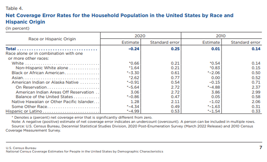
The Census undercount report found that in 2020, there was a statistically significant undercount of AI/AN people in both “On Reservation” and “Balance of the United States” populations. This undercount is shown in Table 4 from the U.S. Census Demographic Analysis which is provided in Figure 2 below. We recognize that “Balance of the United States” is not precisely the same as urban areas, since it also includes many non-urban areas that are not part of Tribal lands.  This adds another layer of inaccuracy, since inaccuracies specific to the urban AI/AN population count is hidden within the “Balance of the United States” undercount.  The majority of AI/AN people (over 70%) live in the “Balance of the United States”, including in the 38 metropolitan areas where Urban Indian Organizations (UIOs) are present.ix, x

Figure 2: Net Coverage Error Rates for Household Populations in the United States by Race and Hispanic Origin from the U.S. Census Post-Enumeration Survey Demographic Analysis.

Source: U.S. Census Bureau: Decennial 2020 Census: Post-Enumeration Survey Demographic Analysis.

The undercount for the “Balance of the United States” AI/AN population, which includes urban AI/AN populations, was mostly unreported by mainstream media sources. These sources pointed to the large undercount in the African-American, Hispanic, and the AI/AN population living “On Reservation”, but they failed to mention the statistically significant undercount among the AI/AN population in the “Balance of the United States”. In fact, one institution published “the American Indian or Alaska Native population not living on reservations was not miscounted.” This statement is incorrect, since the U.S. Census Demographic Analysis showed a statistically significant undercount of 0.9% in the AI/AN population in the “Balance of the United States” in 2020.xi This dismissal continues the erasure of the urban AI/AN population in data, news, and the consciousness of the public.

Census Enumeration Process: Self-Response Rate

To understand better how undercounting can occur we must take a closer look at the process of collecting data for the Census.  The first stage of the Census is the self-response operations. This is when each household in the country is sent the US Census survey to fill out and return. The 2020 Decennial Census was the first-time respondents were allowed to return their census online instead of by phone or mail. Self-response is considered the “gold standard” of census taking because of its high accuracy.xii Some areas followed an Update/Enumerate (UE) method, where census enumerators were sent to interview households and update the address frame, or an Update/Leave (UL), where the enumerator goes to the location to update the address frame and then leaves census forms there. These areas included Remote Alaska areas and American Indian areas that requested for initial interviews to be done by an enumerator. After the period for self-response expires, the U.S. Census undergoes Non-Response Follow-Up (NRFU) operations which include sending enumerators to confirm vacancies, conduct in person interviews and using administrative records to impute demographic information about incomplete enumerations.xiii Despite efforts to improve accurate coverage during NRFU, enumerations from NRFU increase the chance of erroneous enumeration and omission compared to enumerations from the self-response phase.xiv

NCUIH Self-Response Rate Analysis

NCUIH analyzed the cumulative self-response rate (SRR) by census tract within the 38 cities served by UIOs and compared it against the AI/AN population in those tracts.xv,xvi We chose to limit our analysis to UIO service areas in order to focus on an urban AI/AN population with access to the culturally competent healthcare and community services provided by these UIOs. In this analysis, we combined those who identified as AI/AN alone as well as those that identified as AI/AN in combination with other races, henceforth referred to as “AI/AN alone or in combination”.  To protect identification of AI/AN people, census tracts with fewer than 20 AI/AN people were excluded. Additionally, census tracts where the population was less than 0.5% AI/AN were also excluded for the same reason. Finally, to respect the sovereignty and privacy of Tribes with land in UIO service areas, census tracts with American Indian land in them were also excluded. In all, 20,423 census tracts were included in our analysis, while 1,228 census tracts were excluded for any of the previously listed reasons.

In our analysis we used graphs and linear regression to determine the association of AI/AN population concentration and SRR, for all UIO service areas aggregated as well as for each service area separately.  We also used maps to show the distribution of AI/AN population within these UIO service areas, and the relationship with SRR.

SRR Results

Our regression analysis indicated a statistically significant negative association between AI/AN population and SRR. For every 1% increase in the AI/AN percentage of the tract population, the self-response rate decreases by 0.68 percentage points.

In the data tool below, Figure 3, a scatter plot with a line-of-best fit is plotted relating the percentage of AI/AN people and the SRR for each UIO service area. Each point in the scatter plot represents each census tract. You can change the UIO service areas by clicking on the arrow tabs at the top of the tool. Additionally, the data tool includes a drop-down menu to select a specific service area of interest.

Figure 3: Interactive Graph showing Association between AI/AN Population Concentration and SRR in UIO Service Areas

The map data tool at the top of the page, Figure 1, can be used to explore service areas in more detail.

  • To view one of the infocards about a particular UIO service area, click on one of the circles where a UIO is located, and the tool will zoom into a card showing information about self-response rates and the AI/AN population in the service area.
    • Each card includes the total AI/AN alone or in combination population in that area as of the 2020 Decennial Census as well as two maps, one showing the self-response rates by census tract and another showing the AI/AN population percentage by census tracts.
    • Census tracts that were excluded in the analysis were not shown in these maps.
    • The card also includes the average self-response rate for the tracts in the area in addition to the percentage of tracts with low SRR (<60%) and the percentage with high SRR (80%+).
    • Each card includes the percentage of the AI/AN population that lives in the low SRR tracts and the percentage that live in the high SRR tracts.
  • There are two hidden zoom areas for western Montana and northern California to select a UIO more precisely in those regions.
  • To return to the entire map, click on the “home” button on the right side of the data tool, or scroll out with the mouse wheel.
  • The data tool also includes a glossary of terms and data sources used to do this analysis at the bottom right of the “home” map.

In sixteen UIOs service areas, AI/AN population is more strongly associated with lower self-response rate, which you can see where the percentage of AI/AN population in low SRR tracts is higher than the tracts with an SRR less than 60%.

Discussion of NCUIH SRR Analysis Results

Others have demonstrated the relationship between low self-response rate and increased inaccuracy in the U.S. Census.xii,xvii,xviii Between the significant undercount of AI/AN people in cities and the underreporting of the undercount, the urban AI/AN community remains partially hidden from the general population’s and decision maker’s view. The implications of this undercount to the urban AI/AN community are many, including inaccurate reference data needed to inform survey design aiming to record urban AI/AN respondents.19xix This will only exacerbate the gap in research on this overlooked population. Additionally, this undercount could jeopardize health in the population, as federal spending calculations, including the budget for the Indian Health Service, are affected.xx,xxi,xxii

As the U.S. Bureau of the Census undergoes its planning of the 2030 Census procedures, we need to have voices and evidence showing the arbitrary inequities in enumeration. Research such as this shows the need for changes, as we cannot forget that urban AI/AN people exist and thrive, and issues and inequities that affect this community cannot be overlooked.

i US Census Bureau Newsroom Archive. (2012, May) Census Bureau Releases Estimates of Undercount and Overcount in the 2010 Census. U.S. Census Bureau. https://www.census.gov/newsroom/releases/archives/2010_census/cb12-95.html#:~:text=The%202010%20Census%20undercounted%202.1%20percent%20of%20the,0.7%20percent%20was%20not%20statistically%20different%20from%20zero.

ii Kreiger, N (2019, Aug). The US Census and the People’s Health: Public Health Engagement from Enslavement and “Indians not Taxed” to Census Tracts and Health Equity (1780-2018). American Journal of Public Health: 109(8):1092-1100. doi: 10.2105/AJPH.2019.305017.

iii Wines, M. and Cramer M. (2022) “2020 Census Undercounted Hispanics, Black and Native American Residents.” The New York Times. https://www.nytimes.com/2022/03/10/us/census-undercounted-population.html.

iv Schneider, M. (2022) “Some Minority Groups Missed at Higher Rates in 2020 US Census.” AP News. https://apnews.com/article/us-census-bureau-hispanics-census-2020-d284cdbe32fd9ad1a1ad3794cd4d0362.

v Wang, H.L. (2022) “The 2020 census had big undercounts of Black People, Latinos and Native Americans.” National Public Radio. https://www.npr.org/2022/03/10/1083732104/2020-census-accuracy-undercount-overcount-data-quality.

vi Ax, J. (2022) “U.S. Census Undercounted Latinos, Black People and Native Americans.” Reuters. https://www.reuters.com/world/us/us-census-undercounted-black-people-latinos-native-americans-officials-say-2022-03-10/.

vii Marra, E., and Kennel, T. (2022, Mar) Source and Accuracy of the 2020 Post-Enumeration Survey Person Estimates. U.S. Census Bureau. https://www2.census.gov/programs-surveys/decennial/coverage-measurement/pes/2020-source-and-accuracy-pes-estimates.pdf

viii Khubba, S., Heim, K., and Hong, J. (2022) “National Census Coverage Estimates for People in the United States by Demographic Characteristics; 2020 Post-Enumeration Survey Estimation Report.” U.S. Census Bureau. https://www2.census.gov/programs-surveys/decennial/coverage-measurement/pes/national-census-coverage-estimates-by-demographic-characteristics.pdf.

ix Urban Indian Health Institute (2023) Urban Indian Health. Urban Indian Health Institute. https://www.uihi.org/urban-indian-health/#:~:text=7%20out%20of%2010%20American%20Indians%20and%20Alaska,Indians%20and%20Alaska%20Natives%20live%20in%20urban%20areas.

x Whittle, J (2017, Sep) Most Native Americans Live In Cities, not Reservations. Here are their Stories. The Guardian. https://www.theguardian.com/us-news/2017/sep/04/native-americans-stories-california.

xi Benson, S. (2022) “Census undercounted Black people, Hispanics, and Native Americans in 2020”.Politico. https://www.politico.com/news/2022/03/10/2020-census-undercount-black-people-hispanics-native-americans-00016138.

xii Salvo, J.J., Jacoby, A., and Lobo, A.P. (2020) Census 2020: Why Increasing Self-Response is Key to a Good Count. Significance. https://academic.oup.com/jrssig/article/17/1/30/7029480.

xiii Fontenot, A.J. (2022, Feb) 2020 Census Operational Plan: A New Design for the 21st Century. U.S. Census Bureau. https://www2.census.gov/programs-surveys/decennial/2020/program-management/planning-docs/2020-oper-plan5-and-memo.pdf.

xiv O’Hare, W.P. (2020) Are Self-Participation Rates Predictive of Accuracy in the U.S. Census? International Journal of Social Science Studies: 8(6). https://doi.org/10.11114/ijsss.v8i64967.

xv CRVRDO. (2021) US Census PL 94-171 Redistricting Data. United States Census Bureau. https://www.census.gov/programs-surveys/decennial-census/about/rdo/summary-files.html.

xvi United States Census Bureau. (2021) Decennial Census Self-Response Rates (2020, 2010). United States Census Bureau. https://www.census.gov/data/developers/data-sets/decennial-response-rates.html.

xvii Center for Urban Research (2020). “Census Self-Response Rates Mapped: 2000, 2010, 2020.” The Graduate Center: City University of New York. https://www.gc.cuny.edu/center-urban-research/research-projects/census-maps.

xviii Center for Urban Research (2020). “HRC 2020: Hard-to-Count Maps.” The Graduate Center: City University of New York. https://www.censushardtocountmaps2020.us/?latlng=40.01079%2C-98.08594&z=4&promotedfeaturetype=states&baselayerstate=3&rtrYear=sR2020latest&infotab=info-rtrselfresponse&filterQuery=false.

xix Jacobson, L. (2020) “Could an Undercounted 2020 Census Affect a Range of Federal Statistics.” Politifact. https://www.politifact.com/article/2020/aug/26/could-undercounted-2020-census-afflict-range-feder/#:~:text=Problems%20with%20the%20basic%20population%20count%20could%20have,spending%2C%20education%2C%20income%2C%20inequality%2C%20and%20poverty%2C%20experts%20said.

xx Macagnone, M (2020, June) Census Trying to Fix History of Undercounting Minorities. Roll Coll: Policy. https://rollcall.com/2020/06/18/census-trying-to-fix-history-of-undercounting-minorities/.

xxi Hale, K (2020, Mar) Being Undercounted in the U.S. Census Costs Minority Communities Millions of Dollars. Forbes. https://www.forbes.com/sites/korihale/2020/03/24/being-undercounted-in-the-us-census-costs-minority-communities-millions-of-dollars/?sh=5f24d6ce3aa0.

xxii George Washington Institute of Public Policy (2020, Apr) Counting for Dollars 2020: The Role of the Decennial Census in the Geographic Distribution of Federal Funds. The George Washington University. https://gwipp.gwu.edu/counting-dollars-2020-role-decennial-census-geographic-distribution-federal-funds.

Be a Good Relative: What We Learned

Wonderful news; the National Council of Urban Indian Health has just completed its Be a Good Relative Campaign (BAGR). NCUIH is committed to the continuation and promotion of vaccine equity for Urban Indians. The BAGR campaign was launched to provide educational material on vaccines culturally tailored to Native and Urban Native communities. This series of four videos, promoted on February 16th, April 20th, April 29th, and June 16th.

These videos have been one of our most successful campaigns yet, reaching many people thanks to enhanced promotion for the third and fourth videos. The first video (#BeAGoodRelative Campaign: Flu Immunization) had 311 total views, with 5 reshares and 23 likes. It received 1,318 impressions. The second video posted on April 20th (#BeAGoodRelative Campaign: COVID-19 Myths vs Facts) was viewed 4,473 times, retweeted 104 times, and liked 656 times. The link was clicked 75 times.  The impressions on this video were 17,936 and the engagements were 1,275. The third video (#BeAGoodRelative Campaign: Annual Vaccines) had 249 total views, with 5 reshares and 4 likes. The last video (#BeAGoodRelative Campaign: Youth Immunization), was also quite successful. The video was viewed 3,182 times, retweeted 96 times, and received 472 likes. The link was clicked 53 times. The impressions on this video were 11,063 and the engagements were 819.

Feedback surveys showed that the second and final BAGR videos were effective at reaching and engaging the Urban Native community on vaccination.

One Third of respondents did not receive a COVID-19 vaccine. 66% were very likely to get vaccinated after watching the video, and only 5% were still not likely to get vaccinated.

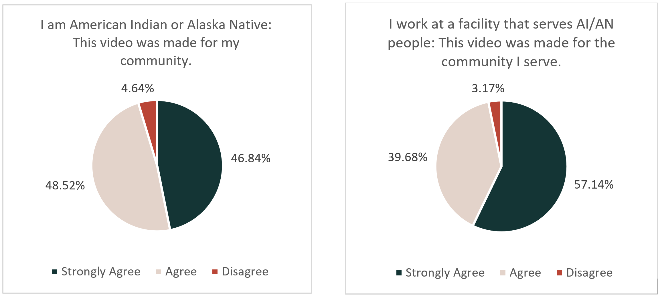
Further, of the 271 AI/AN people who responded to the feedback survey, they overwhelmingly agreed that the video represented their community. People who worked at facilities that serviced American Indians and Alaska Natives also agreed that these videos were representative of the communities they serve.

Be a Good Relative: What We Learned


Be a Good Relative: What We Learned


Respondents were also asked what factors were the most important when considering getting a vaccine. There was a range of sentiments, the most prevalent of which was a desire to protect oneself against the virus and the disease. However, there were also a substantial group of respondents who indicated concerns for the safety of the vaccine as well as potential side effects. Additionally, respondents indicated that they would consider the effectiveness of the vaccine in protecting against the virus, a desire to protect their family or community, as well as trying to stop the pandemic. Some of the less common concerns were the perceived cost of acquiring the vaccine, access to the vaccine and equity, as well as more trials for effectiveness and safety. Knowing this we can see what sort of messaging would be most receptive to our community.

NCUIH thanks the Urban Indian community and everyone who viewed and provided feedback to our #BeAGoodRelative Campaign. We have learned much about effective vaccination messaging for our community. Moving forward, we will continue to share materials to promote vaccination and vaccine equity that our community would find helpful and useful.

Social Support for Elders May Help Prevent Cardiovascular Disease and Death

Researchers from the University of Washington Seattle released a report on Valentine’s day that shows that increasing social support could not only improve depressive symptoms, but also prevents cardiovascular disease and even pre-mature death in older American Indian and Alaska Native (AI/AN) people.

Researchers studied AI/AN adults who participated in the Strong Heart Family Study from 12 communities in over 3 regions between 2000-2003 and, “ .” There was a correlation between those who had reported depressive symptoms, lower quality of life, isolation, heart disease, and death.

Participants in the study were middle-aged adults. The depressive symptoms cited were emotions such as anger self-criticism, and cynicism, and were matched with poor quality of life and isolation. However, better social support saw lower cynicism levels, anger, and trauma. Researchers found that depression and a poorer quality of life, along with social isolation created a higher risk for mortality and cardiovascular events. However, social support lowered that risk. Overall, the study suggests that social support leads to better mood and quality of life in AI/AN elders, and may even lower cynicism, stress, and overall disease risk.

Urban Indian Organizations already provide so much programming and support for their elders, not only in the form of social connections, but also health services. It is a priority to connect elders to one another and other resources to help address social determinants of health and close the health inequalities that urban Indian communities face in the United States.

Suicide Statistics in AI/AN Communities on the Rise: Recent Updates from the CDC

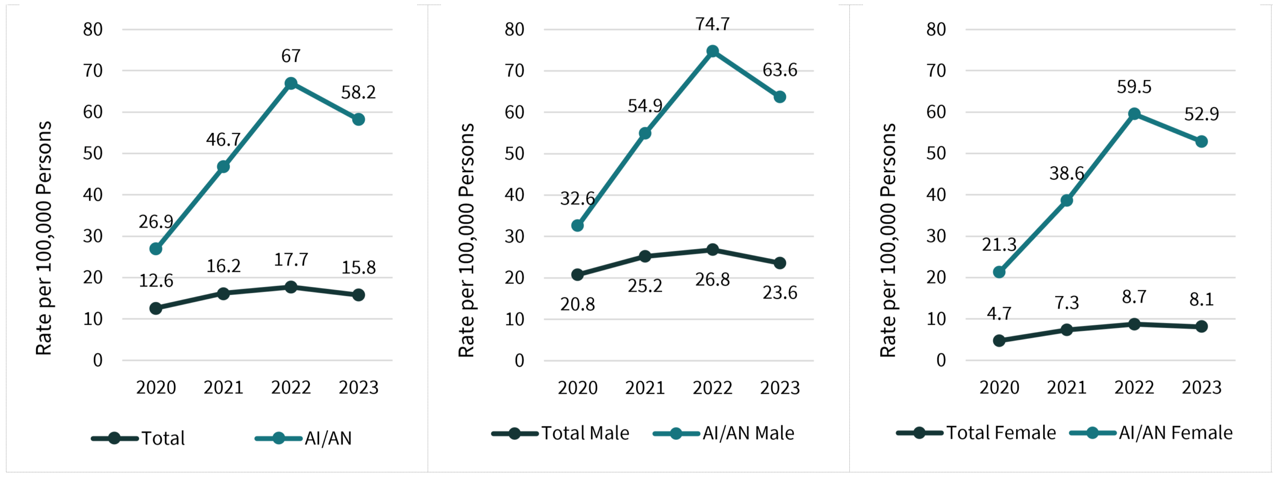
During November 2021, the CDC released a report on “Provisional Numbers and Rates of Suicide by Month and Demographic Characteristics: United States, 2020”, which covers initial pandemic-era data on suicide rates nationwide.

One of the most important findings for the AI/AN community that the study found is that, “for males, age-adjusted suicide rates were higher in 2020 than in 2019 for non-Hispanic Black, Non-Hispanic AI/AN, and Hispanic males and lower for non-Hispanic White and non-Hispanic Asian males.” Suicide is a complex multifaceted public health issue, which affects the AI/AN community at disproportionate rates. Although suicide rates decreased for many non-Hispanic White groups within the country, they increased for many other ethnic minority groups including non-Hispanic American Indian or Alaskan Native people. Due to a lack of overall research on issues pertaining to the AI/AN community and the complex issues related to suicide, studies like this are necessary to highlight the impact of mental and behavioral healthcare on AI/AN communities (and the supports that are needed). Without data, organizations and the nation are unable to provide accurate support and solutions.

The COVID-19 pandemic has caused many public health issues to be amplified, such as ongoing issues with mental health, substance abuse, financial difficulties, as well as many other factors. Due to the COVID-19 pandemic, many of the possible risk factors associated with suicidal behavior may have increased, which increases the concern that deaths by suicide in 2020 might have increased as well. This report details the numbers of deaths by suicide by the demographics of sex and race and Hispanic origin, by month for the year 2020. These statistics are then compared with final 2019 rates. Rates are compared year-to-year to monitor changes within key demographics by year.

These provisional estimates are based on 99% of all 2020 death records received and processed by the National Center for Health Statistics, but this likely is still an undercount of AI/AN deaths. Since 1979, over 45% of people who self-identified as AI/AN on a national survey had their race misclassified after death (usually as White).


Citations:

Centers for Disease Control and Prevention. (n.d.). Vital Statistics Rapid Release – cdc.gov. CDC.gov. Retrieved January 20, 2022, from https://www.cdc.gov/nchs/data/vsrr/VSRR016.pdf

Revealing Vulnerability to COVID-19 in Urban American Indian and Alaska Native Communities

Urban Native communities exist and thrive across this country, with 38 areas served by an Urban Indian Organization (UIO). These UIOs have been an indispensable source of culturally competent care to these communities during the COVID-19 pandemic as you can see in our previous post: Visualizing COVID-19: A Year in Urban Indian Organization Service Areas.

However, a lack of COVID-19 statistics continue to obscure the full burden that UIOs wrestle with. We know that cities are affected by COVID-19, but how are AI/AN communities affected within these cities?  A single count of cases across a county assumes that the extent of the pandemic is uniform within the county, but we know that’s not the case.  Especially in urban areas, neighborhoods and communities wildly vary in terms of resources, systemic deprivation, and the ability to resist natural disasters such as a pandemic.  

Resilience and vulnerability to natural disasters can be illustrated using the Social Vulnerability Index (SVI), a metric developed by the CDC and the Agency of Toxic Substances and Disease Registry. The SVI has been utilized for research in racial and geographic disparities in COVID-19 response, such as in AlabamaLos Angeles, and Louisiana and has also been used as a reference resource by public health departments. Research has shown that historically marginalized communities tend to live in areas of higher vulnerability, and areas of high SVI also have seen the most COVID-19 cases and deaths. Put together, this means that the full extent of the COVID-19 pandemic for the Urban AI/AN populations is not reflected in public county-level COVID-19 statistics. 

IS EVERYONE EQUALLY VULNERABLE WITHIN A CITY? 

Public health statisticians too often overlook urban AI/AN communities . And while AI/AN communities are often proportionately small when compared to the total population of the cities in which they live, great lessons can be learned from including them in analysis. AI/AN people do not live in an evenly dispersed pattern in most cities.  In fact, in many cities, they live concentrated in areas of disproportionately high social vulnerability, compared to the white population in the same city. This makes the presence of UIOs even more crucial, as they deliver life-saving services to areas of the highest need.

Urban AI/AN populations are more clustered in higher SVI census tracts than the white population in 30 out of 38 UIO service areas.  Further, in tracts that are extremely vulnerable – defined here as the top 10% most vulnerable tracts nationally – the concentration of AI/AN people is at least twice that of the local white population in 18 service areas.   

In the link below you will find an interactive map showing all 38 UIO service areas with information about the COVID-19 pandemic, the Urban AI/AN population, and the social vulnerability in each city. You can navigate this map by clicking on the black outline of any service areas to zoom in on summary statistics. Each map and chart can be magnified further by clicking on it. You can return to the main map by moving your cursor to the far right and clicking the home button or return to the prior page by clicking the arrow. You will also see a button on the main map with a glossary showing explaining all our methods and data sources used for this analysis.  Images may take a few moments to load. 

Clicking on a service area, the tool shows

  1. The county’s COVID-19 case and death count, illustrating that available COVID-19 statistics are coarse and uninformative for an urban setting.
  2. The urban AI/AN population is not equally spread across the service area. 
  3. Service areas and the neighborhoods within them vary in their level of vulnerability.  In many service areas the AI/AN population is more concentrated in areas that are more vulnerable to COVID-19.

These three points are illustrated in the red, green, and blue maps on each of the service area info-cards.

After selecting a service area, click the “SVI Graphics” button on the lower right and you will be navigated to statistics and visualizations about the relationship between SVI and service areas AI/AN population. Nearly all service areas show that more of the urban AI/AN population live in the most vulnerable tracts in their cities (Figure D).  Equally, in many UIO service areas, fewer AI/AN people live in the most resilient areas compared to the white population, forming a downwards-sloping distribution curve (Figure E).  In the most vulnerable areas, the ratio of AI/AN population to the same city’s white population is often high, representing the disproportionate vulnerability to disasters such as the pandemic (Figure F).

As an example of reading the figures and statistics, let us look at the Minneapolis/Saint Paul service area. As of April 14th, 2021, the area had 161,171 COVID-19 cases and 2,522 COVID-19 deaths cumulatively since the start of data collection (Figure A). These statistics are reported at the county level for Hennepin and Ramsey counties. But the Urban AI/AN community is not equally distributed across these counties (Figure B).  The Twin cities are wildly unequal in terms of community resources. Census tracts in the Minneapolis/Saint Paul service area range from among the most resilient in the country to the top 1% most vulnerable in the country.  The Urban AI/AN population tends to live in the more vulnerable tracts in this city (Figure C). Clicking on the “SVI Graphics” button will take you to an analysis showing the association between AI/AN-race and SVI in the Twin Cities. In this Metropolitan area there are 51 tracts that are in the top 10% most vulnerable in the nation. 21.7% of the local urban AI/AN population live in these most vulnerable tracts. Meanwhile only 4.5% of the city’s white population lives in those vulnerable tracts (Figure D). Figure E groups the census tracts into blocks of five, each approximately 1% of the service area, and orders them by their vulnerability. It then plots the percentage of the white and AI/AN populations that live in these tracts. You can see along the entire continuum of vulnerability in the Twin Cities, the AI/AN population is more likely to live in high-SVI neighborhoods and less likely to live in low-SVI areas than the white population.  Figure F shows the magnitude of this problem by measuring the ratio the concentration of AI/AN and white residents in areas of differing SVI. At some points (the 50 most vulnerable tracts) the AI/AN population is more than five times as concentrated in these areas than the white population.  Taken as a whole, these figures act as a corrective to county-level data, revealing a level of vulnerability to the virus that is not reflected in COVID-19 statistics. 

CONCLUSIONS 

In many urban areas, AI/AN people face additional vulnerability to the pandemic (and other disasters) simply because of where they live.  This compounds with the other challenges we know they face.  Explore the interactive map in other areas to see that this relationship holds across the country.  Relying on one county-level number for cases and deaths during to the pandemic effectively masks the vulnerabilities that AI/AN community’s face within those counties.  

Yet, due to a lack of accurate racial data on cases and deaths, county-level data is often the only thing key stakeholders see. It is more important than ever to push for accurate and reliable statistics for COVID-19 cases and deaths, particularly for racial minorities.  Efforts have already been made to collect and publish better statistics showing racial breakdown of COVID-19 cases and deaths.  Urban AI/AN communities need to ensure that they too are being counted.  Ensuring that more specific geographic and racial COVID-19 data is in the hands of those who rightfully own and can effectively utilize it is crucial to alleviate the burden faced by Urban AI/AN people.  As we have shown, even a proportionally “small population” can face a massively disproportionate burden in their home cities. This problem should be revealed and treated as a priority.  

By Alexander Zeymo & Andrew Kalweit, posted on Monday August 2, 2021

This post is supported by the Centers for Disease Control and Prevention of the U.S. Department of Health and Human Services (HHS) as part of a financial assistance award (NOFO OT18-1802, titled Strengthen Public Health Systems and Services through National Partnerships to Improve and Protect the Nation’s Health) funded by CDC/HHS. The contents are those of the author(s) and do not necessarily represent the official views of, nor an endorsement, by CDC/HHS, or the U.S. Government.

VISUALIZING COVID-19: A YEAR IN URBAN INDIAN ORGANIZATION SERVICE AREAS

URBAN NATIVE COMMUNITIES: AN OVERLOOKED POPULATION 

Urban Native communities often battle a set of myths – especially the stereotype that American Indian and Alaska Native (AI/AN) people only live on reservations or rural areas. Urban AI/AN people often must prove that they exist in order to obtain the resources they need to address the health disparities their communities face. The first year of the COVID-19 pandemic has only made data on the needs of Urban AI/AN communities more important. However, some public health systems have characteristically overlooked AI/AN people and contributed to widespread disparities. 

First, a list of realities: 

  • The COVID-19 pandemic, which has plagued our country for over a year now, was first detected in UIO service areas.  The first U.S. case was reported in the Seattle area by late January2 and community transmission detected in Santa Clara County by late February.3  Both areas experienced the first known COVID-19 deaths due to community transmission by mid to late February.4,5   
  • In the first year of pandemic data, there were more than 28,646,373 confirmed cases of COVID19 nationally, and 514,117 reported deaths associated with COVID-19 (as of February 28, 2021.)   
  • Cities have been the most affected by the pandemic, accounting for 84.5% of cases (n = 24,197,682) and 82.9% of deaths (n = 426,271) shown in figures 1. 
  • However, different cities have had different experiences over the past year due to state and local differences in mitigation measures and resource allocation. 
  • Each urban AI/AN community is different. Yet across the nation, Urban AI/AN people face specific disparities that put them at a higher risk of severe COVID-19 or transmission of the virus.  Urban AI/AN people are about three times more likely to live in poverty, be uninsured, or have diabetes compared to their non-Hispanic White neighbors. And Urban AI/AN people are 1.5-1.8 times as likely to live in multigenerational or crowded housing, smoke, or have asthma. 
  • There are 41 Urban Indian Organization (UIOs) with over 70 facilities, located in 38 cities across the country.  Each provides their local AI/AN community with culturally-competent services.

Urban Indian Organizations have been on the front lines of the pandemic since it began. They are coping with increased pandemic-related need, despite limited budgets and resources. But how do UIO service areas compare to the rest of the country?  How have their needs and conditions changed over time?  

CHARTING THE PANDEMIC IN SERVICE AREAS  

Hotspots and outbreaks of the novel coronavirus have transitioned across the USA, through Southern California, the Southwest, and the Northeast as seen in figures 2 and 3.  In each region, Urban Indian communities face the most extreme brunt of the pandemic, with stretched resources and high social vulnerabilities to the virus in their clientele.   

Figure 2: Evolution of New 14-Day COVID-19 Cases from 03-01-2020 to 02-28-2021  

Figure 3: Evolution of Case Rate (New 14-Day COVID-19 Cases per 100,000 population) from 03-01-2020 to 02-28-2021 6

In fact, each UIO service area has been in the top 10 percent counties by number of new cases at least once in the past year. Further, each service area has been a high risk of transmission zone for at least 11 weeks in the past year. But each has faced a different challenge.   

To see how conditions have fared in different UIO service areasuse the interactive map below. 

This interactive map allows you to zoom in on each UIO service area, and see how this area has fared over the last year compared to the rest of the country. To zoom in on a service area, click the thick black lines outlining the UIO regions. You may need to zoom in with your mouse-wheel on some areas, particularly where multiple UIOs are clustered like in the Bay area and western MontanaYou can then zoom into figures and maps using your mouse or by clicking on the figuresTo zoom back out, move to the far right hand side and you should see two buttons. You can return to the starting national map by clicking the “home” button, and zoom-out to the previous page using the “up-arrow” button. Learn more about our data sources and the measurements used by clicking the glossary button on the lower right hand side of the map.

For example, let’s walk through how to use this with the example of Los Angeles County, where roughly 165,513 AI/AN people live (see figure A below).  By February 28th 2021, there were 1,190,894 confirmed COVID-19 cases and 21,328 deaths.  Since March 2020, Los Angeles has been in the top 10 counties in the nation by 14-day rolling average of new cases for 43 weeks (figure B). During weeks it was not in the top 10 counties, LA was still in the top 32 (or 10%) of counties – which are signified by the red and gold line respectively.  Figure C shows how the 14-day rolling new case average has changed over the course of the pandemic, specific to this service area. You can see that cases peaked locally in December-February with a smaller peak in late July. Figure D shows these new cases in the form of a transmission rate, which factors in the population of the Los Angeles area and compares this with the CDC COVID-19 risk categories. Case rates above the red line indicate “high transmission risk” and the gold line indicates the cutoff for “substantial transmission risk”7. As you can see, Los Angeles county has been at high transmission risk category for 25 weeks, or 48% of the last year. Figure E and F shows the number of new deaths over time.

Figure A                                                     Figure B


As you can see, Los Angeles county has been consistently ranked at the top of US counties by number of new cases every week since May 2020, has experienced peaks and valleys, and has generally been a very “high transmission” county. Such a large and persistent burden will affect the AI/AN population that lives there and the providers that serve them. 

Figure C                                                                                                  Figure D

Figure E                                                                                                 Figure F

CONCLUSIONS 

The story is the similar across the country, in all 38 urban service areas. Please investigate other areas. Some cities saw peaks in the first wave of spring 2020, others in the late summer, and many more in the winter of 2020-2021. Yet at any given time, there was usually a UIO serving in the top counties in the NationNative populations exist in each of these areas, but are often overlooked as a small population.  Even when racial data on cases and deaths doesn’t exist or include AI/AN people, it is important to remember that UIOs have been on the frontlines providing culturally-competent care in the hotspots of the pandemic. We must remember that UIOs are struggling against these surges every day, as are the people they serve.    

NCUIH hopes this data tool brings some awareness of the magnitude of this issueas millions of AI/AN people continue to live and struggle against coronavirus.  We also hope this data is helpful for UIOs in their communication, advocacy, and grant writing activities.   

Remember, you can always ask NCUIH for data analysis or technical assistance via our website. Stay tuned for our second COVID-19 Data Tools postwhere we will dive into the specific vulnerabilities to COVID-19 that AI/AN communities face within cities.

By Alexander Zeymo & Andrew Kalweit, posted on Monday June 28, 2021

This post is supported by the Centers for Disease Control and Prevention of the U.S. Department of Health and Human Services (HHS) as part of a financial assistance award (NOFO OT18-1802, titled Strengthen Public Health Systems and Services through National Partnerships to Improve and Protect the Nation’s Health) funded by CDC/HHS. The contents are those of the author(s) and do not necessarily represent the official views of, nor an endorsement, by CDC/HHS, or the U.S. Government.